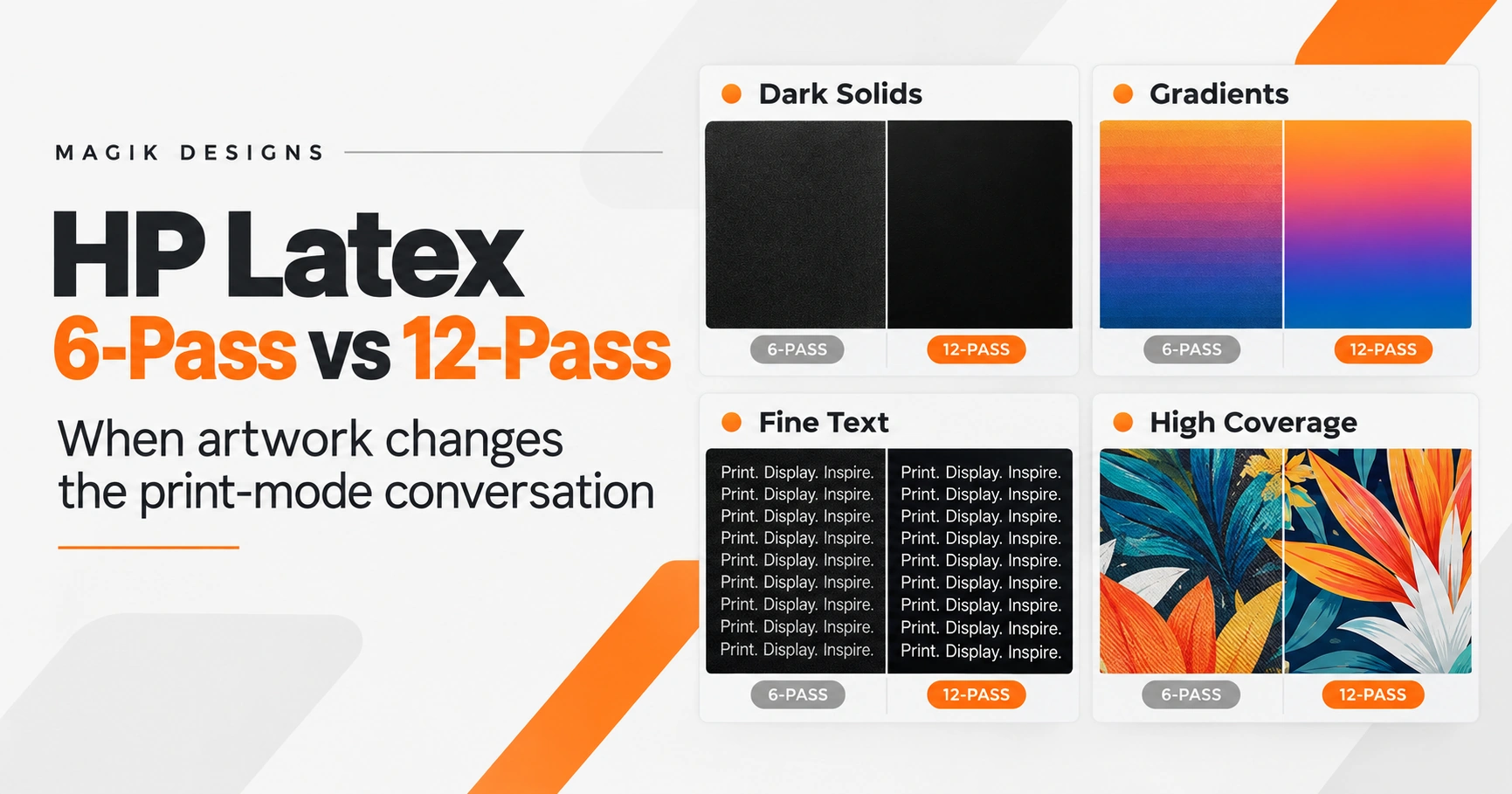
A 6-pass versus 12-pass decision on an HP Latex printer is not always just an operator setting. Sometimes the artwork itself is what puts pressure on the production mode.
Large dark solids, smooth gradients, fine reversed text, heavy shadows, high-saturation colors and other ink-heavy elements can expose weaknesses that ordinary artwork may never reveal.
That does not mean every dark design should be printed at 12-pass.
It means designers preparing artwork for wide-format production should understand that the way a file is constructed can affect how much flexibility the production team has when it reaches the RIP and printer.
That is where print-aware artwork preparation matters.
What does 6-pass vs 12-pass mean on an HP Latex printer?
In simple terms, the number of passes relates to how the printer builds the image across the media. More passes generally reduce throughput while giving the printing system greater flexibility around ink density, curing and image quality.
But pass count should not be treated as a universal quality rating.
The exact relationship depends on the HP Latex model, substrate preset, ink density, application and production profile.
For example, HP currently lists:
- HP Latex 630: 6-pass Standard and 12-pass High Saturation.
- HP Latex 700: 6-pass Production Fast and 12-pass High Saturation.
- HP Latex 800: 6-pass Production Fast and 12-pass High Saturation. HP Support
HP also notes in its technical guidance that increasing the number of passes can allow greater ink density and curing capacity, while reducing passes can increase the risk of artifacts such as grain, bleed and coalescence depending on the substrate and configuration. HP LKC
So the useful question is not:
“Is 12-pass better than 6-pass?”
The useful question is:
“What does this particular artwork demand from the production mode?”
1. Large dark solids expose problems quickly
Imagine a 10-foot wall graphic containing a large area of dark navy.
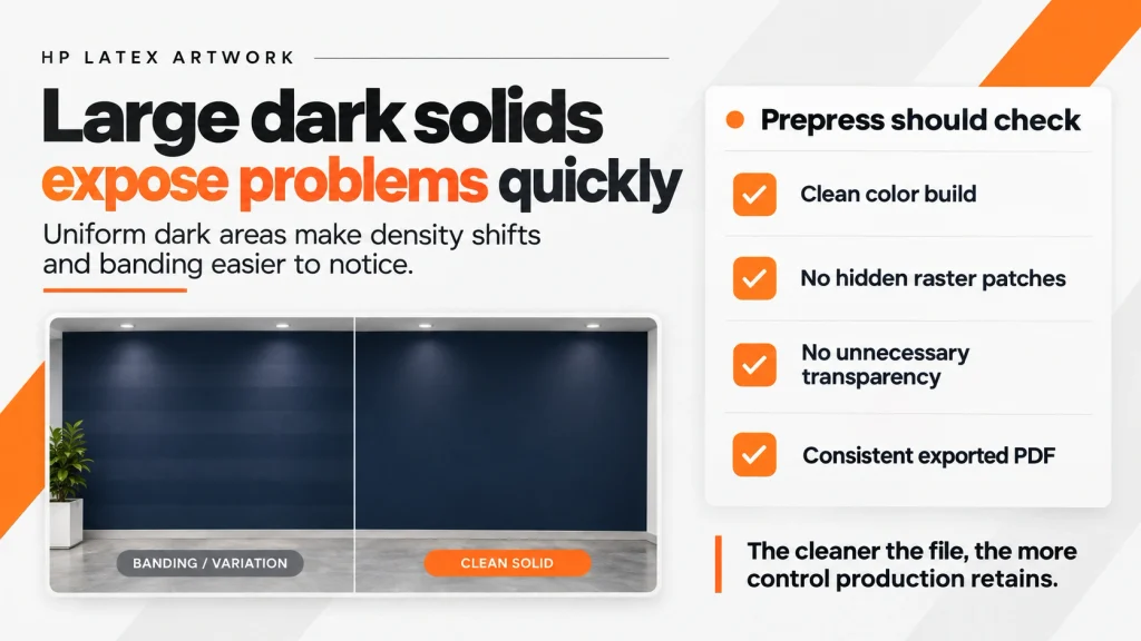
There is very little visual variation in that area. Because the viewer expects the entire section to appear uniform, even relatively small changes in density or visible banding can become noticeable.
Compare that with a detailed photograph containing hundreds of colors, textures and objects. Minor variation can be much harder to see.
This is why large areas of:
- dark blue,
- charcoal,
- green,
- brown,
- black,
- and other dense colors
deserve additional attention during artwork preparation.
HP’s own troubleshooting documentation uses solid area fills when assessing banding and recommends, among other production-side remedies, increasing the number of passes in certain situations. HP LKC
But the designer should not respond by simply saying:
“Print it slower.”
The file should be inspected first.
What should prepress look at?
Check whether the dark color is intentional and consistently constructed.
Look for unnecessary transparency effects, duplicated objects, raster patches inside otherwise vector artwork, inconsistent color builds, low-resolution sections and effects that may have changed during PDF export.
A huge dark rectangle should ideally arrive at production as a predictable object—not a mystery created from multiple transparency groups, masks and raster effects.
The cleaner the file, the more control production retains.
2. Gradients can create problems before the file reaches the printer
A customer may see lines in a printed gradient and immediately assume:
“The printer needs a higher-quality mode.”
Sometimes that is true.
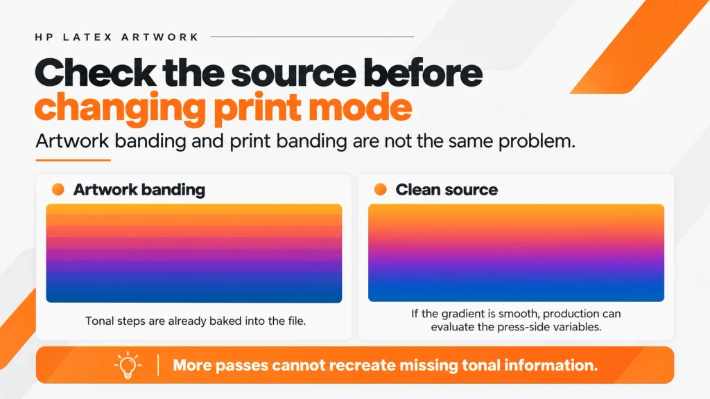
Sometimes the banding is already inside the artwork.
A gradient can be damaged during:
- rasterization,
- image compression,
- low-resolution export,
- transparency flattening,
- color-space conversions,
- aggressive image editing,
- or rebuilding an AI-generated graphic.
If visible steps are baked into the source image, moving from 6-pass to 12-pass does not magically restore information that no longer exists.
That distinction matters.
Artwork banding vs. print banding
Before escalating the print mode, prepress should inspect the gradient itself.
Zoom in.
Check the source artwork.
Determine whether the transition is genuinely smooth before RIP processing.
If the gradient already contains visible tonal steps, the problem should be addressed at artwork level.
If the gradient is clean but the physical output develops inconsistent bands, production can then investigate the appropriate combination of media profile, calibration, print mode and other press-side variables.
This prevents a common production mistake:
using additional printer time to compensate for a file problem.
3. Fine text needs precision, not just more passes
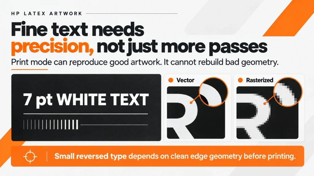
Fine text presents a different problem.
The concern is less about covering a large surface with ink and more about preserving edges.
Small lettering, thin rules, reversed text and detailed logos are sensitive to relatively small changes.
For example:
7-point white text sitting inside a dark background is very different production artwork from 72-point black lettering on a white banner.
The same printer may handle both files, but they do not place the same demands on the output.
Prepress should therefore inspect:
- whether text remains vector,
- whether fonts are correctly embedded or converted,
- whether thin strokes survived export,
- whether small text has unnecessary effects,
- whether raster logos have sufficient effective resolution,
- and whether transparency or clipping masks are interfering with edges.
Increasing the number of passes cannot repair badly rasterized typography.
This is an important distinction for production designers:
Print mode can improve how the printer reproduces good artwork. It cannot turn poor source geometry into good geometry.
4. High-coverage artwork changes the production conversation
Ink coverage is where artwork and production become particularly connected.
Consider two 4 × 8 ft graphics.
The first contains:
- white background,
- logo,
- product photo,
- headline,
- small amount of color.
The second contains:
- full dark background,
- heavy shadows,
- saturated photography,
- dark gradients,
- large colored panels.
Their finished dimensions may be identical.
Their production demands are not.
HP specifically notes that more passes can permit higher ink densities and that high-density applications such as backlit work may require different combinations of passes and ink density. Those requirements are also strongly dependent on substrate. HP LKC
That means file preparation cannot be separated completely from the intended application.
A designer preparing artwork for:
banner → adhesive vinyl → backlit film → wallcovering
should not assume that identical visual artwork represents an identical production condition.
5. 12-pass should not become the fix for bad artwork
This is probably the most important point.
When output looks wrong, increasing quality settings can become an easy default response.
But consider a low-resolution customer logo.
Printing it using more passes does not create missing vector information.
Or a badly generated AI image.
12-pass cannot reconstruct facial details or typography that never existed in the source.
Or a gradient containing visible compression bands.
A slower print mode cannot recreate the missing tonal information.
Or 5-point lettering that was rasterized at insufficient resolution.
Additional passes cannot restore the original outlines.
Separate the two problems
A strong production workflow asks two different questions:
Artwork question:
Is the file technically capable of producing the expected result?
Production question:
What print mode, substrate profile and production settings are appropriate for producing it?
Mixing those questions causes unnecessary reprints and lost production time.
6. Why print designers should understand the equipmen
A production designer does not need to operate an HP Latex printer.
But they should understand what happens after their PDF enters production.
That changes the way files are prepared.
A designer who understands wide-format production is more likely to question:
Is that black background really clean?
Is the customer’s gradient actually smooth?
Will that tiny reversed text survive at finished size?
Is this 15-foot graphic relying on a 900-pixel image?
Has this AI-generated artwork been inspected at actual output dimensions?
Are those transparent shadows creating unnecessary high-density areas?
These are artwork questions.
But they directly influence production.
That is why equipment awareness matters even when the designer never touches the printer.
6-pass is not automatically “draft” and 12-pass is not automatically “best”
This misconception is worth removing completely.
Pass counts need context.
HP’s own product specifications demonstrate that terminology changes between printers and applications. On some current Latex models, 6-pass is a standard or production-fast configuration while 12-pass is associated with high-saturation output. HP Support
And HP’s production documentation repeatedly notes that suitable settings depend on factors such as substrate, ink density and application. HP LKC
So there is no responsible universal rule saying:
6-pass = bad
12-pass = good
Instead:
Artwork + substrate + application + profile + expected viewing conditions = production decision.
What should happen before difficult HP Latex artwork reaches production?
For demanding wide-format jobs, artwork should be checked for four things in particular.
Dark solids: Are large uniform colors constructed cleanly and consistently?
Gradients: Are transitions genuinely smooth in the source file, or is banding already present?
Fine text: Are small lettering and thin elements still vector and structurally intact?
High coverage: Does the artwork contain large saturated areas, heavy shadows or other elements likely to place greater demands on the production profile?
None of these checks require the designer to decide how the operator should run the press.
They simply give production better artwork to work with.
And that difference matters when turnaround time is tight.
The better question is not “Which pass mode?”
When challenging artwork arrives, asking whether it should be printed at 6-pass or 12-pass may be jumping ahead.
First ask:
Does the artwork itself create a production problem?
If the answer is yes, repair the file first.
Then let the production team make the appropriate decision for the printer, media, profile and application.
That separation between artwork preparation and press operation is one of the easiest ways to reduce unnecessary troubleshooting.
At Magik Designs, we prepare and repair production artwork for commercial printers and wide-format/sign businesses. That includes file cleanup, artwork rebuilding, vectorization, AI artwork preparation, resizing, production revisions and prepress preparation—so your production team receives files that are easier to move through the workflow.
Good production starts before the file reaches the printer.
Frequently Asked Questions
Is 12-pass always better than 6-pass on HP Latex?
No. Pass count is only one part of the print configuration. HP uses different pass counts for standard, production, quality, high-saturation and application-specific modes depending on the printer. The correct mode also depends on substrate, ink density, profile and intended application. HP Support
Can increasing passes reduce banding on an HP Latex printer?
In some circumstances, yes. HP’s troubleshooting guidance includes increasing the number of passes among possible remedies for certain banding and uniformity problems. However, banding can also originate from calibration, substrate behavior, printheads, ink density or the source artwork itself. HP LKC
Will 12-pass fix low-resolution artwork?
No. Increasing passes changes how the printer outputs the available image data; it does not recreate missing image detail. Low-resolution logos, pixelated AI artwork and damaged raster text may need enhancement, vectorization or reconstruction before printing.
Why are dark solid colors difficult in wide-format printing?
Large uniform areas make changes in density and banding easier for the eye to detect. Dark or highly saturated artwork can also involve greater ink coverage, making the relationship between artwork, substrate and production profile more important.
Should a graphic designer know which HP Latex mode will be used?
The designer does not necessarily need to select the print mode. However, knowing the printer family, substrate, finished size, intended application and expected viewing distance can help the designer prepare a more production-friendly file.